Sunday, December 5, 2010

Dasymetric Map

http://www.uwsp.edu/geo/faculty/ritter/geog101/textbook/essentials/map_types.html

Dasymetric map is a thematic map used to classify volumetric data. This map is used often for population density since it has the ability of realistically place data.

Cartogram

http://www.cbr.washington.edu/papers/jim/draft.html

This above cartogram shows each county in the United States rescaled according to population. The map is distorted to convoy the information in an alternate variable.

Dopplar Radar

http://www.bom.gov.au/weather/radar/about/new_radar_services.shtml

A Doppler radar is able to show the path of a storm and type of precipitation. It can estimate two parameters, reflectivity and rotational velocity.

Cartographic Animations

http://www.wiu.edu/users/cre111/older/CGFinal/paper.htm

Cartographic animations are able to show changes in data in a continues fashion.

Cadastral Map

http://alamedahistory.org/the-map/

Cadastral maps usually help show land or parcel ownership.

Hypsometric Map

http://www.rrcap.unep.org/centralasia/reapreport/map.cfm

Hypsometric maps are used to show differences in elevations in maps and different colors are used to display the differences.

Isohyet

http://www.trc.govt.nz/previous-month-and-year-to-date/

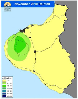
An isohyet uses contour lines to represent the amount of rainfall on a map. Each color in the above map shows the different amount of perception month to data for that location.

Isobars

http://www.csulb.edu/~rodrigue/geog140/lectures/pressure.html

Isobar maps are used to display atmospheric pressure over an area.

Isopach

http://www.searchanddiscovery.net/documents/2007/07022lash/index.htm

This is an isopach map of Oatka Creek Shale and limestone thickness. The map is measured in feet. This site used many different maps to represent information. An isopach map uses contour lines of equal thickness over an area.

Isopleths

http://www.cbr.washington.edu/papers/jim/draft.html

Isopleths generalized and simplifies data with continuous distribution. They are more commonly used to map areas containing elevations, amounts of precipitation, and numerous other measurements. The lines connect points of equal values.

DRG

http://www.tceq.state.tx.us/gis/metadata/drg_met.html

DRG or digital raster graphic is a scanned image of a standard series topographical map. On average these maps contain 250 dots per inch. These maps are standard for the U.S. Geological Survey.

Standardized Choropleth Maps

http://www.statcan.gc.ca/pub/92f0138m/2008003/figures/5200001-eng.htm

A standardized choropleth maps has data that has been standardized to allow for easier comparison of data in different areas.

Bivariate Choropleth Map

http://proceedings.esri.com/library/userconf/proc99/proceed/papers/pap171/p171.htm

Bivariate choropleth maps display two forms of information on a single map. Different colors are used to portray the two types of information at the same time. They have the ability to display how information or variables can relate to each other.

Portolan Chart

http://www.lumenartis.net/index.php?main_page=product_info&cPath=68&products_id=183&language=en
This portolan map depicts the Mediterranean, the Black Sea, the Sea of Azov and the Atlantic coasts of Europe and North Africa. This is another example of cartography from the medieval era.

T-O Map

http://www.palaeos.com/Paleozoic/Ordovician/Tremadoc.htm

A T-O map is an medieval world map and is one of the earliest known maps of its type. It is a representation of the physical known world at that time.

Statistical Map

http://www.arabdev.org/map

This is an example of a statistical map. It is a very simple map displaying the number of people that can be found online in northern Africa and the Middle East.

Saturday, December 4, 2010

Triangular Plot

http://www.ex-parrot.com/~chris/wwwitter/20050407-it_doesnt_matter_how_you_vote_either_way_your_planet_is_doomed.html

A triangular plot makes it easy to show the relation between three variables. This above graph does show different voting styles with the center dot shows what was expected by the voters.

Wind rose

http://www.vistadatavision.com/reports-2/wind-rose/

A wind rose is used to give a view how wind speed and direction are distributed in a location. The site I found this example on had multiple other example of how a wind rose is used and calculated.

Climograph

http://arsc.arid.arizona.edu/migratory/veg_tdf.html

Climogaphs displays the monthly precipitation and and temperature conditions for an area. The precipitation is represented by the bar graph and the line graph shows the temperature. The above graph is a representation of an Arizona regions precipitation.

Similarity Matrix

http://cgi.mtc.sri.com/Cluster-Lab/

Similarity matrix shows similar genes on a scale of 0 to 1, as seen above. The greater the similarity of two objects the higher the value of measure.

Parallel Coordinate Graph

http://informationandvisualization.de/blog/knime-interactive-views

Parallel coordinate graphs is used to visualize multidimensional data and can be used to explore the relationships among variables. There is a connection throughout the graph with the information.

Box Plot

http://www.physics.csbsju.edu/stats/box2.html

A box plot can go by different names. It a great and simple way to display five areas of information. In one look you are able to see the min and max amounts, the average of the information, and the bottom 25% and top 75%.

Population Profile

mailto:http://www.bibliotecapleyades.net/sociopolitica/esp_sociopol_depopu14b.htm

A population profile is a chart showing the of people in the the age group. This above graph represents industrialized countries only.

Scatter Plot

http://onlinestatbook.com/chapter4/intro.html

Scatter plots are a relationship between two variables. There can be a common trend in most scatter plots if the dots head upward as in the graph above then the graph is positive. If the graph is downward then the graph is negative.

Index Value Plot

http://waterwatch.usgs.gov/?m=real&w=plot

An index value plot is a type of visualization map. It depicts the relativity of all values to an indexed value. This map shows the averaged stream slow in North Carolina.

Lorenz Curve


http://planning.gov.mv/hies/cover.htm
This an Accumulation Plot or it can also be known as a Lorenze Curve. The dark line represented in the graph is the lorenz curve. This above example shows household incomes and expenditures, it does contain more information then a basic graph but you are to see how it works.

Bilateral Graph

https://blogger.googleusercontent.com/img/b/R29vZ2xl/AVvXsEi-n1jj9ooGjYHGvdhZ9X9hcDAjzdWKeVnDbixVhSCFrMIYY9ByPBHQiKupgHc2QJAiCmHO48zqiCwVIgxf3gEKKTfVQfYTvtRpeFUUxdPDPhaXbhvkCJLSP1iSbZlqFHuNHKp7iybrBEU/s1600-h/Bilateral+Graph.jpg
I was unable to find a bilateral graph that was not already saved to someones blog site. These graphs are used to represent two variables that are related to each other. While one rises the other decreases and this is what can be seen one the graph.

Thematic Map

http://www.personal.psu.edu/ooo105/Geog482Project2.htm

Correlation Matrix

http://www.image.ucar.edu/GSP/Projects/ResearchNuggets.shtml

Topographic Map

http://geology.isu.edu/geostac/Field_Exercise/wildfire/topography.htm

Friday, December 3, 2010

Pie Chart

http://bigthink.com/ideas/21259

A Pie chart is an example of geovisualization. This is an example of countries involvement in Antarctica. By walking in a complete circle around the South Pole you would be able to visit all the claims made on Antarctica.