Sunday, November 21, 2010

Aerial Infrared

http://www.thousandislandslife.com/backissues/archive/tabid/393/articletype/articleview/articleid/158/aerial-infrared-photographs.aspx
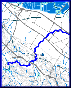
Aerial infrared photographs are able to show greater detail, such as vegetation. The photograph shown above is part of group of photographs showing change to the surface culture of the area. Infrared photographs also can show contrast of water. That can be seen in a better example on the link above.

U.S. Public Land Survey System

http://www.ak.nrcs.usda.gov/technical/plss.html
PLSS is set up by first establishing an initial points for a region. Most of the United States follows this system but the original thirteen colonies, Texas, parts of Florida, and a few other small locations. It is usually divided into 6-square mile townships and then townships are divided into 36 1-mile squares.

The site below also contains some great information about the PLSS process and maps to help gain a deeper understanding.
http://www.nationalatlas.gov/articles/boundaries/a_plss.html

Digital Orthographic Quarter Quads

http://www.tceq.state.tx.us/gis/doqtnrcc.html

Digital orthographic quarter quads or DOQQ combines the mixture of an aerial photograph with the geometric qualities that can be found in a map. These maps are useful because they display some features that can be left out of or generalized in a standard map. They can also be used to find direct measurement of distances, areas, angles, and positions.

Digital Line Graphs

http://geography.wr.usgs.gov/sfcreek/dlg.html
Digital line graphs or GIG contain digital vector data that represents the cartographer information. They show information such as boundaries, roads, and utility lines. The map above is representing the San Francisco Creek.

Friday, November 19, 2010

Black and White Aerial

http://www.alamedainfo.com/alameda_antique_maps.htm

Aerial photographs are divided by the film type, and in this example black and white film is used. This is an aerial shot of Alameda, Ca Bay farm in 1939. This photograph helps display why the island is referred to as "Bay Farm Island".

Planimetric Map

http://www.nps.gov/history/history/online_books/fova/clr2-5c.htm
Planimetric map are maps that do not show any relief on them. Street maps are a great example of this type of map. They can show rail roads, sidewalks, roads, and highways. It is also known as a line map.

Mental Map

http://fasica.altervista.org/adam/adam_en.htm
Mental map are very interesting and very personal to a person. A mental map is one's internal map of a location. They are abstracted representations of real locations.The site listed showed multiple maps of Amsterdam by different people. The point of the exercise was to show how one's interpretation of a city is different then the actual location and from person to person it can differ.

Sunday, November 14, 2010

Kriging Map

http://www.gisdevelopment.net/proceedings/mapindia/2006/environment%20and%20forestry/mi06envi_148.htm
A kriging map is used to map continuous point data. It uses a mathematical procedure to produce the information. Then map on the left is to show the CO pollutant level while the map on the right is to show the prediction error of CO pollutant.

Proportional circle map

http://geographyfieldwork.com/DataPresentationMappingTechniques.htm

This is another example of a point pattern map. A proportional circle map is able to give more information in the circles since they are pie graphs.  The circles themselves give information and then is able to be broken down more with the graph. In this map there are five different circle possibilities.

Dot Density Map

http://www.flutrackers.com/forum/showthread.php?t=6379

This map is fulled with multiple information but is also a good a example of a dot density map. In this map one dot equals 7 herds or swine farms in a area. It is to display the effect of the virus H3N2 in the areas. To me this map has more of a clustered look since some farms are far apart, while some areas are heavily populated.

Range-graded Proportional Crcle Map

http://www.neiu.edu/~ejhowens/377/examples.htm
Proportional map is a point pattern map, instead of displaying information by dots it uses a circle to do so. The circle size relates to the variable being measured and there is a set number of circles used. The above map is displaying the Filipino population in selected states and it is using a set of four circles.

Isotachs Map

http://atm.ucdavis.edu/~grotjahn/course/atm111/lect/Map_Interp_Fcsts/gfs_300.htm

The above is a isotach map which is a form of a contour map. These maps are used to display the wind speed in locations. The site this map was found at displays multiple maps of wind movement in The United States.

Sunday, November 7, 2010

Bathymetric Map

http://www.epa.gov/ne/boldkids/scienceonboard.html
A bathymetric map is a contour representaion of the elevation of the sea floor. Looking at the above map, the purple areas shows the deepest areas along thiese islands.

LIDAR Map

http://coralreefs.wr.usgs.gov/mapping_lidar.html
LIDAR or Laser-based Imagery utilizes laser pulses to make a detailed topographical map. It is also able to gather data up to three times greater in depth then aerial photographs. The above example shows a hole that is found in the coral reef in South Moloka'i.

Flow Map


http://www.improving-visualisation.org/vis/id=206

This is a flow map of trade between The United States and China. The width of lines are proportional to quantity.

Propaganda Map

http://www.guardian.co.uk/artanddesign/gallery/2010/jan/26/british-library-map
This site had a great amount of maps showing propaganda. It is an exhibit in a British Library and the whole point of the exhibit is to demonstrate how maps have multiple uses. This map above is a Nazi representation of Churchill being a demonic octopus trying to take control of Africa and the Middle East.

Propaganda maps are used to manipulate opinions and create a visual that when you think of someone or something that is the first thing you think of.